Loading page
Loading page
Skip to contentBrand · Aditya Vahlevy Nugraha
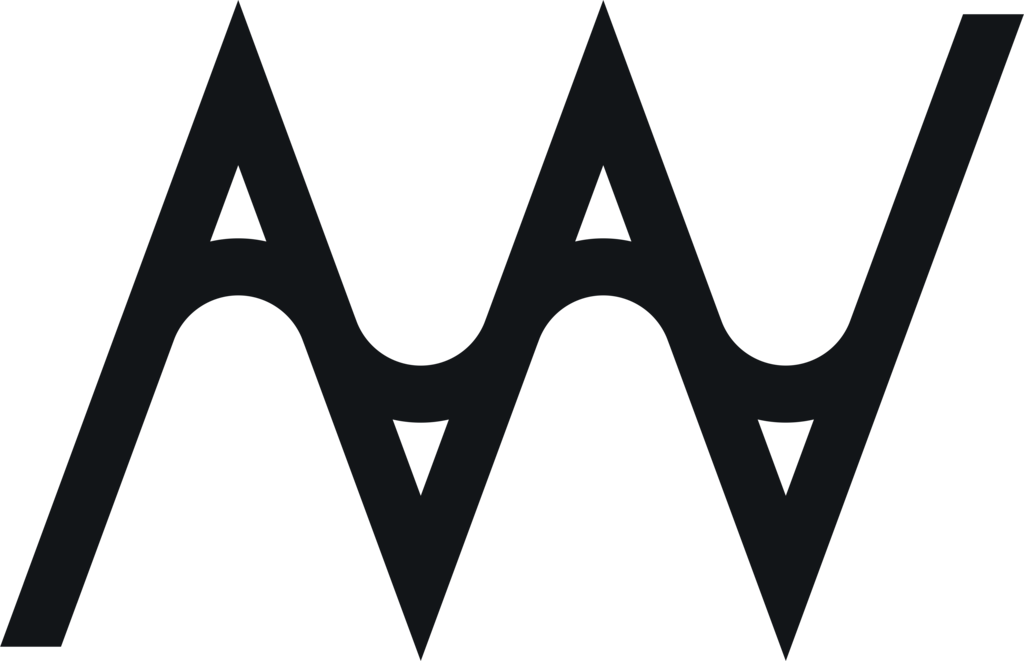
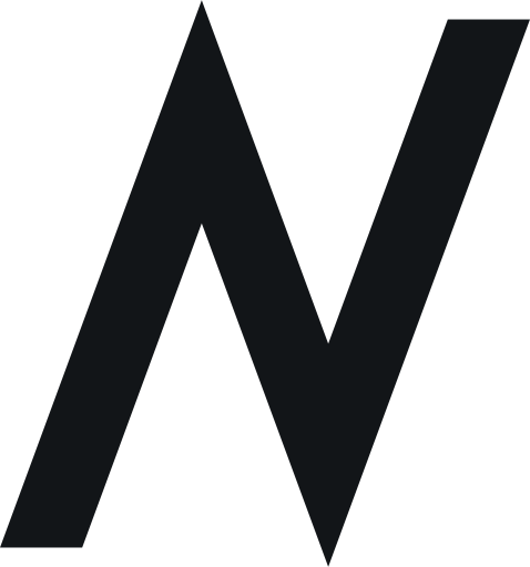
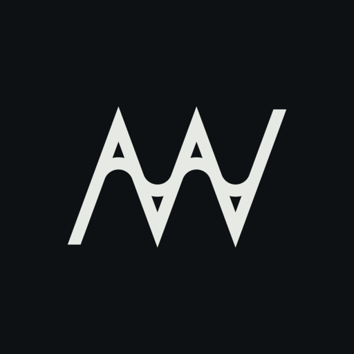
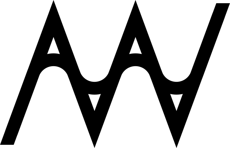
A drops its bar and becomes Λ. Joined to a V, it makes an N. So one zigzag carries all three initials. A wave runs the same path with every turn rounded: the sharp line is how I build software, the curve is the person building it. Every measure comes from one height and φ = 1.618.
Click the mark to redraw the wave.
01 · The name
Point at a line to light its part of the mark.
Aditya
A without its bar: two strokes meeting at a point. The wave passes under the point and puts a bar back, so every peak reads as an A again.
Vahlevy
The next two strokes, the same angle turned over. The second stroke of Λ is the first stroke of V. Nothing is drawn twice.
Nugraha
Λ and V joined make /\/, which is an N on a slant. The last three strokes close the name, so five strokes carry all three letters.
The wave
One continuous stroke over the same path, every turn rounded. The sharp line is the engineer, the wave is the hand. Where they part, small counters open.
02 · Shape
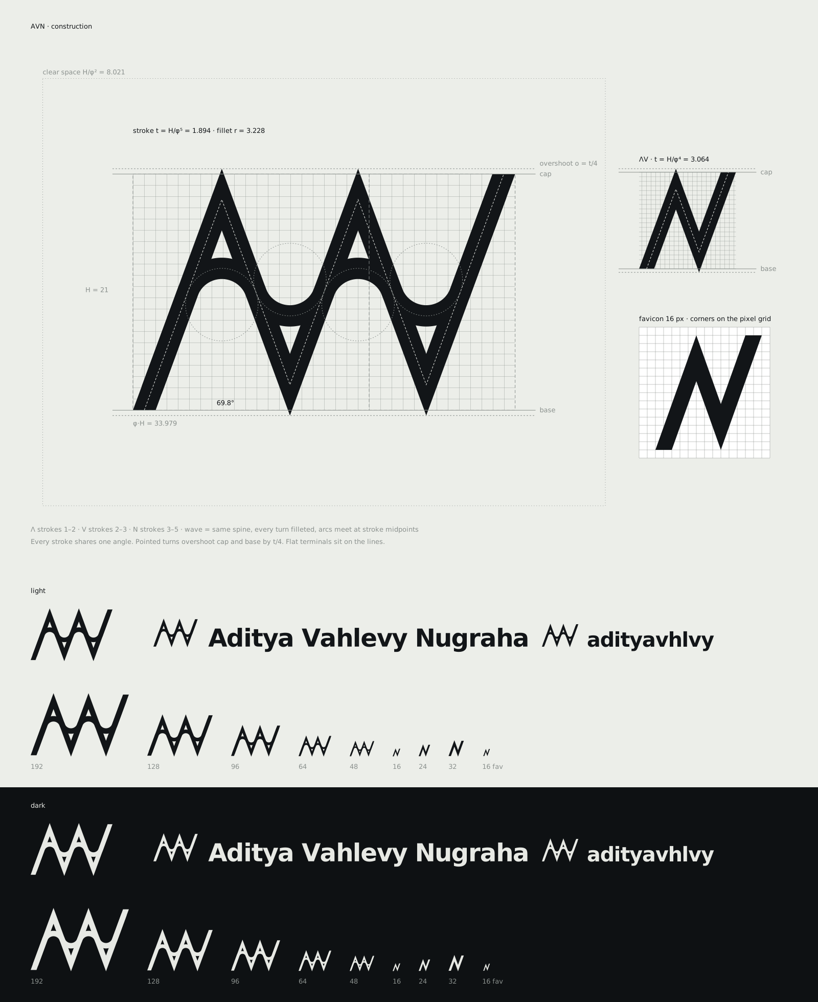
Cap height H = 21
Every other measure comes from H and the golden ratio. 21 is a Fibonacci number, so the steps stay near whole units.
Golden box, φ : 1
The mark is exactly φ·H wide, 33.98 units. The angle is solved to make it so, not picked by eye.
One angle, 69.8°
All five strokes lean the same way from the baseline. No stroke is adjusted on its own.
Stroke t = H/φ⁵
1.89 units, one weight for the zigzag and the wave. The dashed line is the spine both are built on.
Overshoot o = t/4
Points look shorter than flats, so every pointed turn passes the cap or base line a little. The two flat terminals sit exactly on the lines.
Wave radius r = 3.23
Each turn of the spine is filleted with the largest radius that fits, so the arcs meet at every stroke's midpoint and the wave is made only of arcs.
Clear space H/φ²
8.02 units on every side, about a third of the height. Nothing else enters it, including the words.
03 · Size
Under 48 px the counters close and the wave turns to noise. So small sizes drop to ΛV alone, three strokes with a heavier weight. It is still A, V, and N. At 16 px the favicon is redrawn on the pixel grid: cap and base on whole rows, every outer corner on a pixel corner.
light
dark
04 · Colour
Ink
--ink · 15.7 : 1 on paper
The mark is one ink on one ground. It has to work as a stamp, an emboss, and a 16 px tab before it earns a colour.
Paper
--paper · Ground for everything
Cool chart paper. In dark mode the two swap: paper becomes night, ink becomes light.
Colour, later
The site keeps its sea blue as an accent for links and focus. The mark does not use it yet. A colour for the mark comes once the shape has been tested in one ink.
05 · Type
Aditya Vahlevy Nugraha
adityavhlvy
Lockups
Full name for CVs, cards, and documents. The handle where it is typed: URLs, usernames, the site header. Cap height of the words is H/φ, baselines align, and the gap is the clear space H/φ².
Archivo
Words, headlines
Semibold, width 112, tracking −3%. The width axis does the work a second font would.
IBM Plex Mono
2026 · 69.8°
Data only: years, codes, values, labels.
06 · Kit
- Aditya Vahlevy Nugraha
Lockup, full name
CV, business card, slides, documents. The default when there is room for the whole name.
- adityavhlvy
Lockup, handle
Site header, GitHub, anywhere the name is typed as one word.
Mark
Avatars, portfolio, stickers. 48 px wide and up.
Small mark
ΛV alone, for anything under 48 px: inline icons, small avatars, watermarks in a corner.
 163248
Favicon
Browser tabs and bookmarks. Drawn on the 16 px grid. Follows the system light or dark setting on its own.
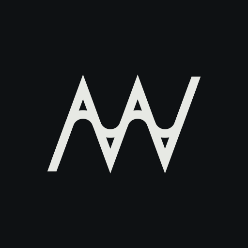
App icon
Home screen shortcut and installed web app. The mark on a night tile, 1/φ of the tile wide.
- Loader preview
Loader
First paint and page changes. The only version that loops, because loading is still happening.
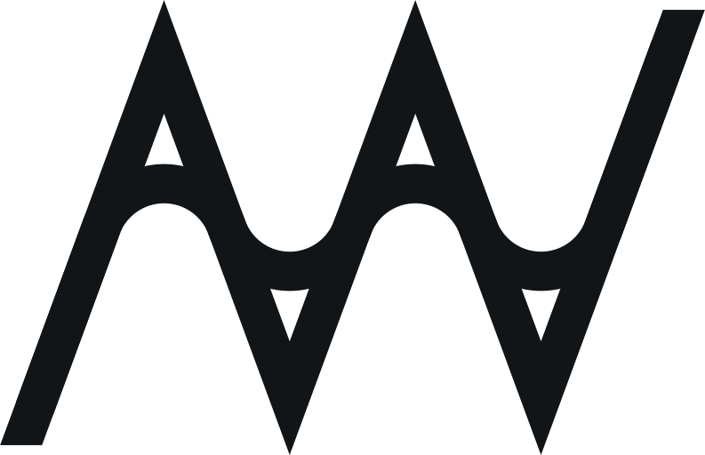
One colour
Stamps, embossing, single-ink print. Takes the colour of the text around it.




07 · Motion
Arrival
The zigzag writes itself along its spine, once, then the wave follows on top.
Touch
Hover or focus the logo in the header. The wave redraws over the sharp line.
Loader preview
Loading
The only loop. A pen runs the line over a faint copy. Under reduced motion it holds still.
08 · Keep it
Don't: Use the full mark under 48 px. The counters close. Use ΛV.
Don't: Stretch or slant it. Every stroke shares one angle.
Don't: Draw the wave alone. Without the sharp line it is a squiggle.
Don't: Turn it over. Upside down the A reads as V.
Don't: Add glow or gradient. It is one flat ink.